Through the research, it was evident that the influx of cats pouring into animal shelters around the country greatly surpasses adoption rates, which leads to overcrowding. As a result, many shelters suffer from resource strain, being unable to keep up with so many cats looking for homes. While the practice has diminished significantly over the years, euthanasia is still an outcome for millions of cats each year. Thanks to the research, however, a solution to the problem presented itself: the creation of a Shelter Cat Advocacy Tool Kit.
This Tool Kit is a targeted educational package of information aimed at arming animal welfare professionals—such as shelter staff, veterinarians, and more—with methods to help reduce the strain on shelters while at the same time improving the lives of the cats they work to help.
It was decided that physical, print-based deliverables were preferable over digital-only components, as the items in the Tool Kit are meant to engage people regularly over time. Additionally, physical items are more likely to be retained for extended periods of time, while digital assets (e.g. social media posts) are disposable in the sense that audiences will likely forget about by the end of the day. To that end, print-based items that people can hold in their hands, hang onto over time, and hand out to other people, are far more likely to have a lasting impact.
STRAY & STAY CAT COALITION

The first component and perhaps most important starting point for this entire project is the visual identity of the hypothetical brand, Stray & Stay Cat Coalition (or Stray & Stay for short). For the Tool Kit to be successful and taken seriously by animal welfare professionals, the need for an umbrella organization to oversee the development and distribution of the contents in the kit was needed. Major organizations such as Alley Cat Allies, ASPCA, American Humane, iHeartCats, etc. were developed to provide places for like-minded people to work together in support of cats living both on and off the streets. As such, it was necessary for a unique brand to oversee the Tool Kit and fulfill a similar purpose. This is where Stray & Stay Cat Coalition comes into play.
THE BRAND NAME
The brand’s name was the first element to be determined, as the rest of the design choices were directly impacted by it. The words “Stray” and “Stay” allude to the fact that the brand cares about all cats equally, whether they are community cats living outside as unowned cats, or those housed in foster care, shelters, or those who already have a home. The “Coalition” aspect of the brand’s name indicates that the organization is a group of allies who have come together for a singular purpose of combined action. In this case, that purpose is to help cats. The other deciding factor behind this word was its alliteration with the word “Cat” before it, making the entire brand name easy to say and remember. I considered using the word “Kitty” instead of “Cat” to make it sound cute, upbeat, and friendly; however, when I reflected on the purpose behind the brand (i.e. to help improve the lives of both community and shelter cats) I felt that “Cat” came across as more mature. Additionally, this brand is meant to work together with professionals in the animal care field, and as such the word “Kitty” loses much of the brand’s authenticity and even comes across as immature or childish. Given the brand’s need to stand with professionals in the field as equals, I decided “Cat” was a more appropriate term.

THE DESIGN
The Stray & Stay logo utilizes the Gestalt principle of figure-ground in design. That is, the logo makes use of positive space (the figure) in the form of the simplified home and the heart shape. Meanwhile, the negative space (the ground) that is created by that positive space forms its own shape. This allows the viewer’s mind to interpret the negative space as its own, distinctive shape, which in this case is that of a cat looking upwards as if facing a person not seen in the logo. The design of the shapes for the logo itself illustrates the brand’s desire to help cats live happier, healthier lives. Much like Alley Cat Allies, who uses a cat-shapes silhouette in a circular pattern as part of their main logo, Stray & Stay is making use of a cat silhouette, but created via negative space thanks to the simplified house framing it. Finally, the heart within the cat’s chest places a focal point within the logo to further emphasize both the brand’s love for cats, and to say that cats have big hearts and can be lovable companions at the same time.
The logo also required a font pairing that would complement the image’s design without it being distracting. Many of the organizations in the mood board in Chapter 3 or found in parts of the visual analyses use clean and easy-to-read typography for their logos and overall visual identity. The same needed to be true for Stray & Stay, choosing Marvin Round as the primary font choice due to its heavy weight and rounded letters. This font could be used in the logo, as well as for titles and headers for published content. The strong font emphasizes the brand’s strength and determination to help cats, while its rounded, playful curves showcase a light-hearted side that wants to help cats live happier, healthier lives. To compliment Marvin Round and the logo itself, the rounded sans serif font Nunito was chosen. Its clean lines, simple shape, and rounded edges work well with both the main font choice as well as the logo itself without taking away from either in terms of visual weight. Nunito is also the ideal choice to make up sub-headers and paragraph styles for published content.
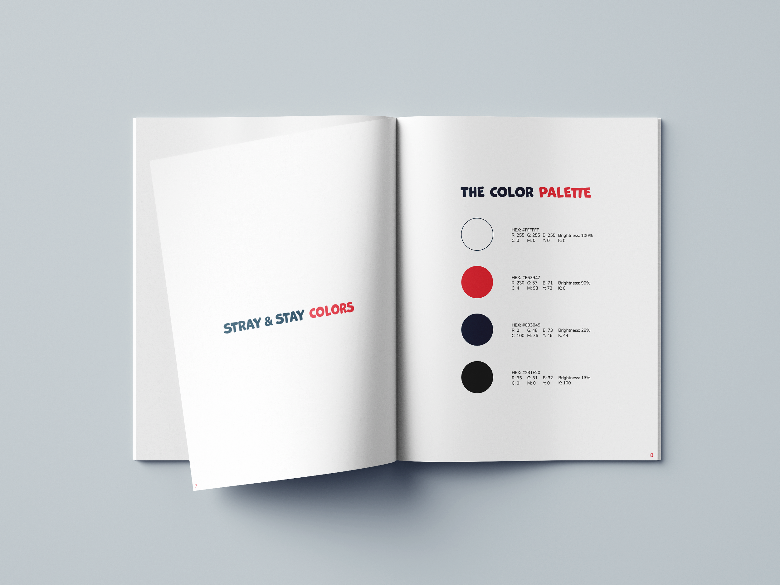
Finally, a color palette for Stray & Stay needed to be something that emphasized both its serious, professional nature as well as its compassionate side. To that end, the brand uses a limited color palette with four colors: white and black for their simplicity and wide-reaching uses, alongside a dark blue and rose-red. Much like how iHeartCats uses a limited palette for their own brand—namely black, white, and red—Stray & Stay Cat Coalition illustrates its nature with its own palette. The navy blue, white, and black demonstrates the brand’s professionalism and dependability while maintaining its modern sophistication and stability. To compliment the navy blue is the rose-red color that gives the brand a warm, heartfelt quality that illustrates its compassion and positive outlook for the future of all cats. The rose red also provides a bold accent color to the navy blue, helping to draw attention to key elements in the design, such as the heart shape of the logo and unifying typography.
To bring the entirety of the brand’s design together, a short style guide was created that lays out the look and feel of the entire Stray & Stay Cat Coalition brand. Within its pages, the brand’s visual identity is demonstrated, first providing a look at its primary logo in three formats: (1) logo image only, (2) logo with vertical text, and (3) logo with horizontal text. It also provides a look at how the font and color choices could be utilized, demonstrating that the logo is versatile and may be applied in a wide number of circumstances.


TNR FACT BOOK & GUIDE

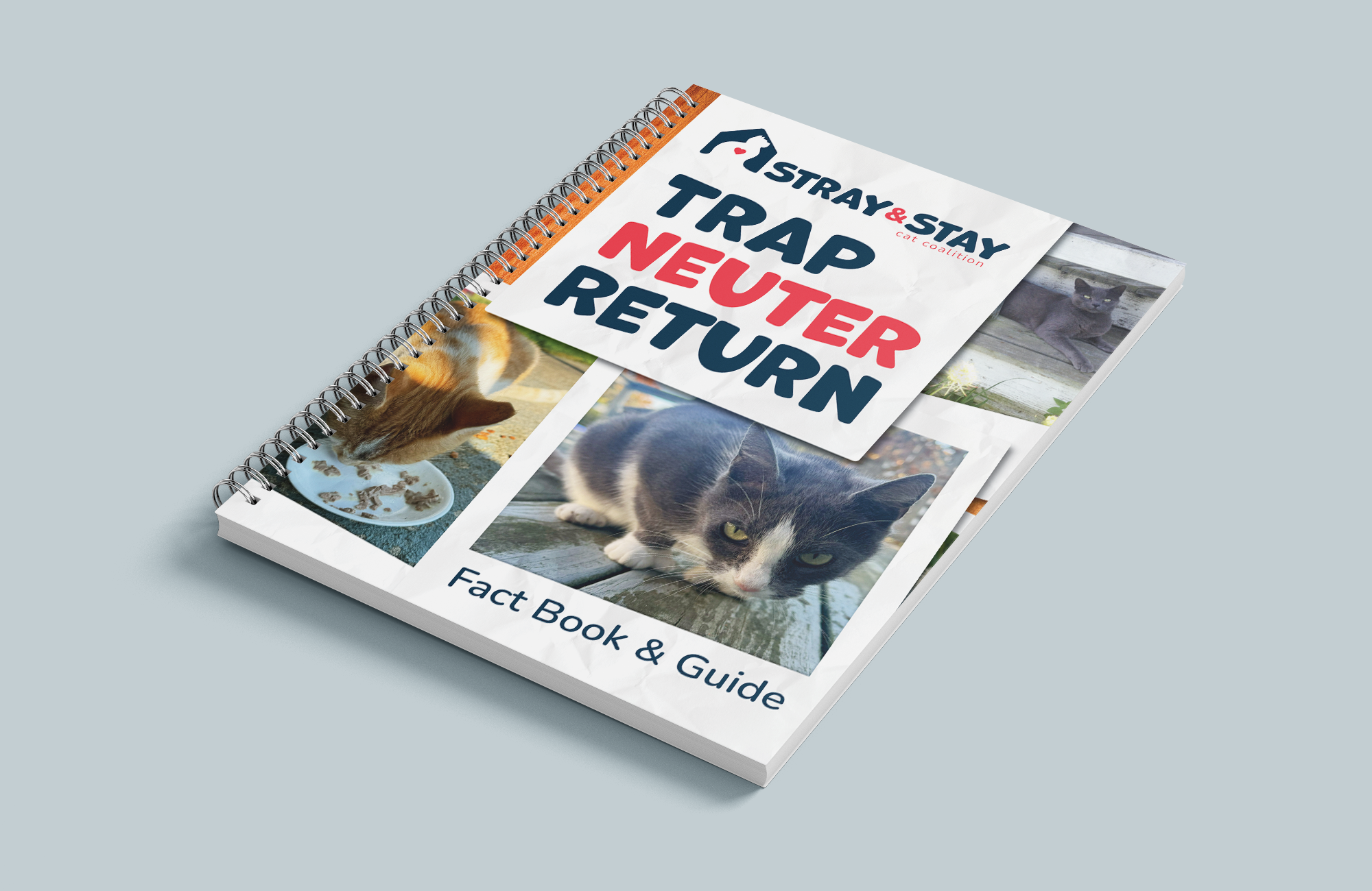
The core component of the Tool Kit is the Trap-Neuter-Return Fact Book & Guide, directly targeting the front end of the shelter cat adoption process: the influx of cats going into shelters. In Chapter 2, several studies found TNR programs were successful in reducing the population of community cats living on the streets of several locations in the United States and abroad. These TNR programs also provided much-needed healthcare for community cats in the form of vaccinations and medical treatment. The most notable aspect of TNR, however, was that such programs have been shown to have a direct impact on reducing shelter cat intake, therefore reducing euthanasia as a result of overpopulation (Levy et al. 271). As such, a book discussing the nature of TNR, outlining the stages involved, would be the first step toward handling information gaps experienced by animal welfare professionals.
Inspired by Alley Cat Allies’ Share the Truth About Cats fact book and Alley Cat Action newsletter, a guidebook that explained the essence of TNR and how to properly implement such a program would be largest component of the Shelter Cat Advocacy Tool Kit and would likely have the greatest impact on the influx of cats entering shelters. This book provides the kit with an opportunity to relay the steps involved in the process as a simple and easy-to-follow guide that would allow shelter staff and animal welfare professionals to determine how best to approach such a program in their own municipalities.
The book, being the most content-heavy component of the kit, required the most initial attention since it is the core of the kit. Its design also set the stage for the rest of the deliverables in terms of its design choices and aesthetics. Several studies referenced in Chapter 2 provided context to the concept that pets of all kinds fulfill numerous roles in the household, ranging from emotional support and companionship to aiding the development of children. Given such a central emotional role, the need for an aesthetic theme that encourages immediate emotional reactions in readers was necessary. Additional research conducted during the visual analyses further exemplifies this need. The Home for Hope campaign, for instance, made use of printed cutouts of shelter dogs placed in an IKEA store to invoke that same sense of empathy and desire to help those dogs that I wanted for the designs in this Tool Kit. Further inspired by the social media post by American Humane in June 2023 for National Adopt-a-Cat Month that used a simple polaroid photograph of a cat being kissed by man, I knew I found the appropriate theme for the various deliverables in this Tool Kit.
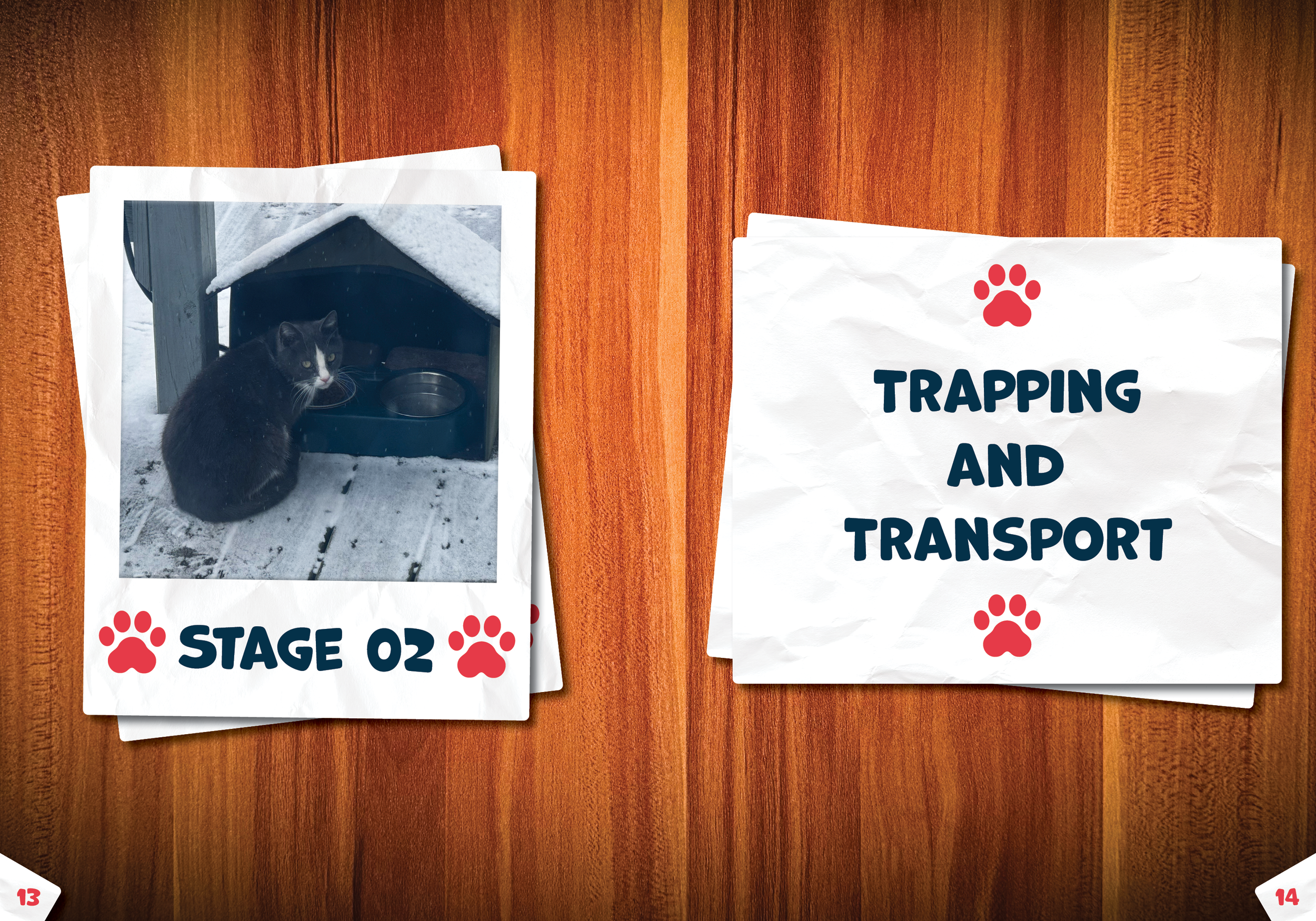
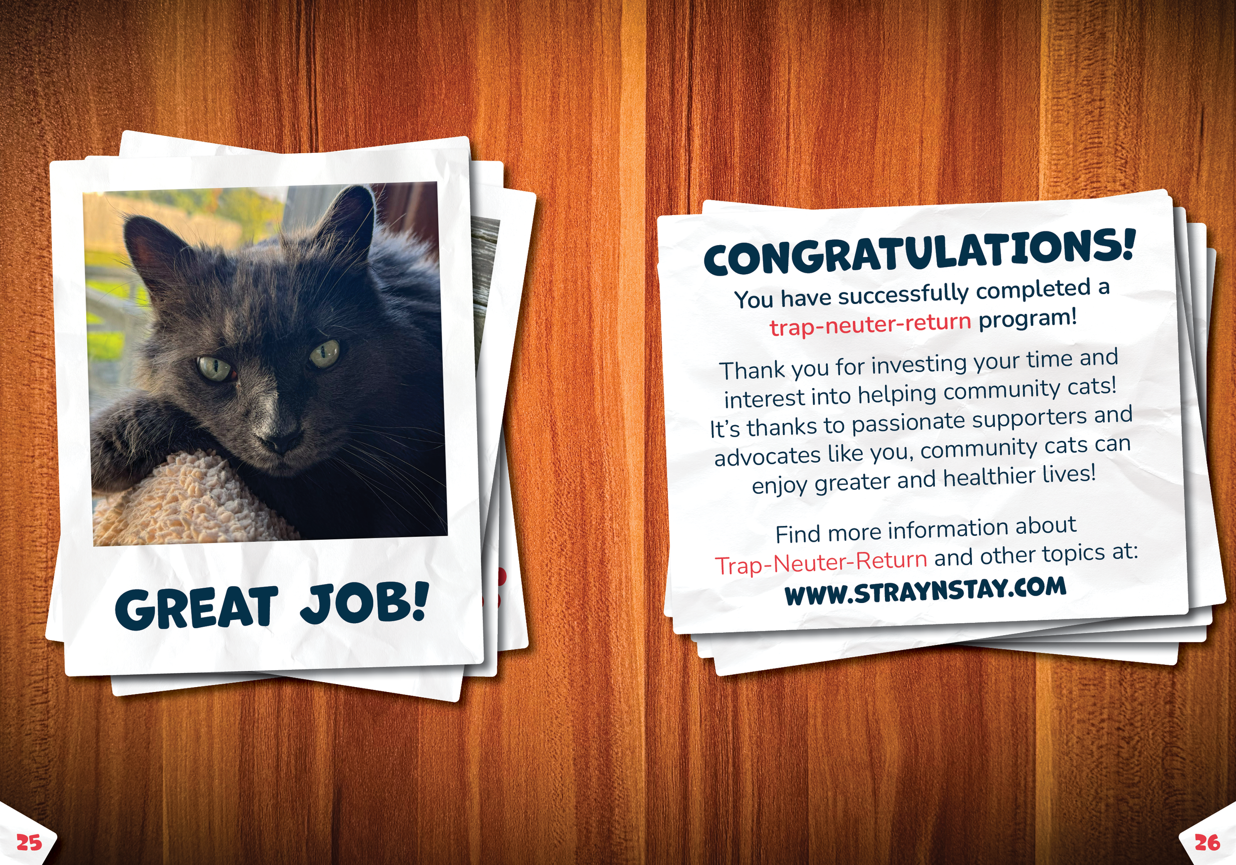
Photographs of community cats and pet cats in the form of polaroids became the driving theme for not only this book, but also the remainder of the content to follow. For the cover, the title “Trap-Neuter-Return” was placed on what was made to look like the back side of a polaroid, making use of the Marvin Round font as previously discussed. Its subheading, “Fact Book & Guide” follows up as if it were written on the bottom of a polaroid, though this time using the secondary font, Nunito, to accent the primary font and not compete with it. The polaroids were then laid on top of one another and angled in seemingly arbitrary ways to give off a sense of organic nostalgia. The point with this layout is to give the reader the impression that these photos were scattered on a wooden table and spread out, as if they themselves were going through fond memories found in these polaroids. The photographs contained within each polaroid showcases a community cat or a pet cat in some form, implying that these are cats the Stray & Stay Cat Coalition brand would be working hard to help.
Continuing the aesthetic initiated by the cover, the interior pages use different photographs and simulations of older paper to repeat the same memory-making appeal as the polaroids. The reader is welcomed with an overview of the book’s purpose and then a call-to-action, encouraging a visit to the Stray & Stay website. It also includes a scannable QR code that will take the reader to the TNR page of that same website. The book continues with an introduction before discussing the various stages of the process. The first stage of TNR can be considered the most important as it involves the greatest amount of work: the preparation phase. This is the time when the program participants need to learn about their target area(s), create the necessary partnerships, and gather the necessary tools. As was previously explained in the style guide, the pages make use of the brand’s colors for its written copy: black for paragraph text, with a combination of navy blue and rose red for headers or important details requiring special attention. The rose red is particularly helpful for calling attention to important details, such as offering warnings or suggestions.
Stage two of the program involves the actual trapping of cats, and the book explains what to do when setting the traps and then transporting them to a holding area. Stage three of the process is largely up to the veterinarians and clinical staff regarding spaying, neutering, and/or providing other medical treatment. Stage four discusses the need for appropriate recovery time and then how to handle the release of the cats back into their home environments. The book wraps up on a positive note, celebrating the reader’s successful TNR program and offering a final call to action, guiding them to the brand’s resource website for further details.


TNR DOORHANGER

As a direct follow-up to the TNR Fact Book & Guide, the TNR Doorhanger was designed to be a useful tool for those who received the Shelter Cat Advocacy Tool Kit. Instead of being an informational item targeting the direct recipients of the Tool Kit, this doorhanger was designed to be given out to their constituents instead. Its primary purpose is to serve as a simple but useful tool that can be disseminated to residents and businesses of affected areas where a TNR program is being planned, helping to foster communication and engagement with the community. According to the research, community involvement in TNR programs has had a marked and noticeable impact on the program’s success. For instance, the TNR program in the San Francisco Bay Trail area included an educational campaign meant to provide information and context to both residents and visitors. Material included brochures and signs placed along the trail. In Alachua County in Florida, shelter staff and volunteers mailed out informational postcards explaining the program to residents and business. Each of these studies, as well as a study conducted in Chile using peer-reviewed articles, showed that science-based education and community cooperation greatly contributed to the success of TNR programs.
With this in mind, I felt that providing recipients of this Tool Kit the means by which to engage affected residents or businesses would be prudent. This interaction took the form of the two-sided doorhanger. The front allows organizers to add their name, contact details, and event date, while the back provides a brief overview of TNR and its benefits. A QR code directs recipients to Stray & Stay’s resource website for more details on the process: www.straynstay.com/trap-neuter-return.
The doorhanger’s design mirrors the book’s polaroid theme to evoke emotion and empathy for the cats. Polaroids line the right side of the front panel and the left of the back, creating the effect of photos being reviewed like cherished memories. Close-up images forge a direct emotional connection, while wider shots depict community cats thriving outdoors, reinforcing their place in the neighborhood. This “emotional hook” aims to engage residents, encouraging interest and potential volunteers for the TNR program.


ADOPTION RISKS TRIFOLD

The previous two assets in the Shelter Cat Advocacy Tool Kit focused on reducing the number of cats entering a shelter, while simultaneously providing medical care. The other side of the shelter cat process, however, is the output of cats. In other words, adoptions. Cats of all kinds find their way through animal shelters the world over, and yet some cats are more likely to be left behind than others. Why? That is what this Adoption Risks Trifold brochure is meant to clarify.
Through the research, I found that the most at-risk cats (i.e. those more likely to never find a home) are those with specific traits, including coat color, age, breed, and personality. A cat’s length of stay in a shelter appears to be directly related to one or more of the aforementioned factors, and it was important that the Tool Kit provide a method of informing audiences as to the natures of these risk factors. That way, those who care for these shelter cats know what to notice and how to devise ways to combat these issues. Inspired by Alley Cat Allies’ TNR For Community Cats: The Basics card, I saw a brochure as an effective way to highlight factors affecting a cat’s adoption chances. To keep it simple and engaging, I prioritized imagery over text, drawing further inspiration from resources like the Help, I Found a Kitten! and the Community Cat Infographic posters. A trifold format offered a clear, shareable way to present key research findings without overwhelming the reader with complicated text.
Like the TNR Fact Book & Guide and TNR Doorhanger, this trifold maintains the polaroid aesthetic, ensuring a cohesive collection despite its focus shifting to shelter cats. Thoughtful placement of polaroids enhances the design, with the cover featuring the title “Adoption Risks!” in Marvin Round font, a brief subtitle, and three polaroids of cats in different circumstances: an orange cat being petted, a gray cat on a scratch post, and an outdoor cat eating. These visuals subtly highlight adoption challenges, contrasting shelter cats with one already in a home.
The trifold’s main content required careful polaroid placement. The first interior panel covers black cat bias, citing research showing black or dark-furred cats face longer shelter stays due to misconceptions and superstitions (Jones and Hart 1201). To emphasize this, a polaroid of a local black community cat was included (see the left-most panel in the mockups on this page). The middle panel highlights the adoption gap between young and old cats, referencing a Tompkins County SPCA study where older cats took six times longer to be adopted than kittens (Brown and Morgan 172-173). To reflect this in the trifold, a polaroid of a kitten was placed front and center, with an older Siamese cat behind it to illustrate how older cats are often overlooked (see the central panel in the mockups on this page), also bridging into the third panel on breed-related adoption challenges. It’s been shown in the same study at TSCPCA that certain breeds such as Siamese, Maine Coon, Persians, etc. are generally adopted more quickly than their common or mixed-breed counterparts (Brown and Morgan 178). To visually impart this information, a polaroid of a Siamese was placed front and center on this panel, with a polaroid of a mixed-breed gray and white cat clearly being overshadowed (see the right-most panel in the mockups on this page).
The inside fold panel explores cat personalities, noting that while each cat in unique, certain traits can impact their adoption chances (see left-most panel in the outside panel mockup). Friendly cats, for instance, are more likely to be adopted over timid or aggressive ones, presenting a challenge for finding a good home for those with difficult behaviors. To illustrate this, a polaroid of a curious gray and white cat sniffing the camera adds a lighthearted touch. Finally, the last outside panel (see middle panel in the outside panel mockups) is the back cover of the trifold, shifting focus now to potential solutions such as encouraging adopters to get to know cats personally or making use of the Blinking & Clicking strategy posters included in this Tool Kit. A call to action via prompting a visit to the website finishes off the trifold.


BLINKING & CLICKING POSTERS


Realizing a cat’s personality has an enormous impact on a cat’s adoptability, I decided that action was needed to help improve shelter cats’ behaviors. To that end, the next component of the Tool Kit is a set of posters presenting strategies that could potentially improve sociability in timid, fearful, or even aggressive cats. Dubbed the Blinking & Clicking posters, each is derived from research studied in Chapter 2 of this thesis. These posters are meant to shed light on the methodologies employed in those studies in simplified formats for easy reference. I felt that posters would be the most practical option in this case because shelter staff could place them on walls in a room inside their facility for quick access as needed. They could also scan each poster’s QR code to visit the resource website for additional details and information.
The first poster in the pair focuses on the use of slow blinking as an indicator of adoptability and method for fostering trust in humans. Slow blinking is considered a behavior that indicates a cat’s trust in humans, as well as that of positive reinforcement and communication. The study conducted by Humphrey et al. in Sussex, England showed that the more a cat slow blinks towards people, the better their adoption chances were. As such, the Blinking poster makes use of this study’s methodology for encouraging the act of slow blinking and therefore improving a cat’s trust in people. The process itself is simple and each step, barring the final one, includes a simple pen-and-ink style illustration that coincides with it. Step one shows a man and cat facing one another with a set of arrows pointing between them to indicate they should be looking each other in the eyes. Step two includes two sets of close-ups of eyes, one of a person’s and the other of a cat’s, illustrating the act of slowly narrowing the eyes. Step three involves rewarding the participating cat with food, with the illustration showing a cat eating from a pile of snacks. Step four is where progress is recorded, including an illustrated pad of paper and pencil to indicate progress should be written down and tracked. The fifth step encourages constant work at this process over time to build trust.
The Clicking poster uses a different approach utilized in a study in Oxfordshire, England that involved clicker training to boost activity and trust in shy, timid, or aggressive cats. Shelter cats often experience a great deal of stress due to new, unfamiliar environments and being around new people, cats, or other animals. This kind of stress can often lead to inactivity, especially in naturally shy and timid cats (Grand and Warrior 77). This poster uses that study’s clicker training method to give shelters a potential strategy for bringing such cats out of their shells and boost activity and trust. Like the previous poster, this one’s steps also pair with simple illustrations to give a visual example of what each step is meant to accomplish. The first step involves getting the cat used to the clicker and eventually training the cat to anticipate a food reward in association with that clicker. As such, the illustration shows a simplified clicker device with an arrow pointing to a cat with an exclamation point over its head to indicate its attention has been captured. Then another arrow points to a pile of snacks, showing that food must be immediately presented after getting the cat’s attention to build that association. Step two shows the same clicker device and cat head illustration, but this time separated by greater distance, as shown by the longer arrow. Step three is all about gradually increasing the distance in each subsequent session, while the final step is where the trainer records their progress with the cat.
For each poster, hand-drawn pen stroke illustrations were chosen to depict each step for these posters for one important reason: to match the personalized nature of the polaroid aesthetic. The aesthetic shown within each of the previously described assets in the Tool Kit is presented in a way that is meant to come across as natural and organic, as if the reader is the one spreading the polaroids and papers on a tabletop as they rummage through collected memories. In this way, the polaroid theme touches on the feeling of warmth and care found in a loving family and fond memories, much in the same way the cardboard cutouts used in the Home for Hope campaign did in an IKEA store (see pages 70-75 of this thesis). The pen-and-ink illustration approach compliments this feeling by being loose and hand-crafted, which only adds to the nostalgic feeling of the polaroid theme and makes for a personal addition to the theme.


BRANDED GEAR FOR HUMANS & CATS


To add a personal touch beyond educational materials, the Shelter Cat Advocacy Tool Kit includes branded gear for both cats and their advocates as the final physical pieces. These items are meant to reinforce Stray & Stay Cat Coalition’s commitment to both feline welfare and the people working to help them.
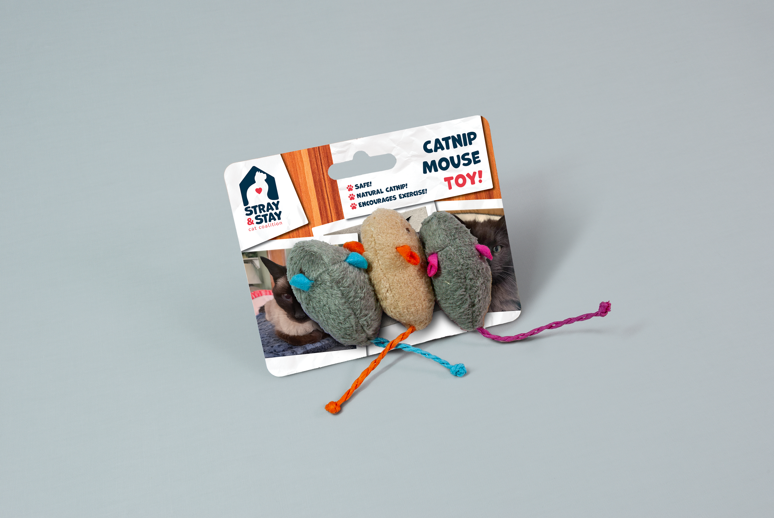
For the cats, the kit contains three items: a set of mouse toys, a condensed catnip ball, and a red collar. Each item’s packaging label follows the polaroid aesthetic utilized in the rest of the deliverables in the Tool Kit, but due to their smaller sizes they have limited space for messaging. To address this issue, the labels instead focus on a simple call to action—visiting Stray & Stay’s website to support the mission—using the phrase “Help us help cats!” As with the rest of the deliverables, each of these items includes a QR code that provides easy access to more information.
For people, the kit includes several items: a t-shirt, coffee mug, pens, socks, and the tote bag that the whole kit itself comes in. The t-shirt and tote bag make use of Stray & Stay’s vertical logotype, while the pens and coffee mug utilize the horizontal version of the logotype. Finally, the socks make use of the previously created repeatable pattern to offer a fun yet supportive design for the brand. These items help strengthen the connection between the brand and recipients while serving a dual purpose: personal enjoyment for the recipients and brand visibility. Every time a recipient wears or uses the gear in this kit, they are promoting Stray & Stay’s mission, making these additions both meaningful and practical.


RESOURCE WEBSITE

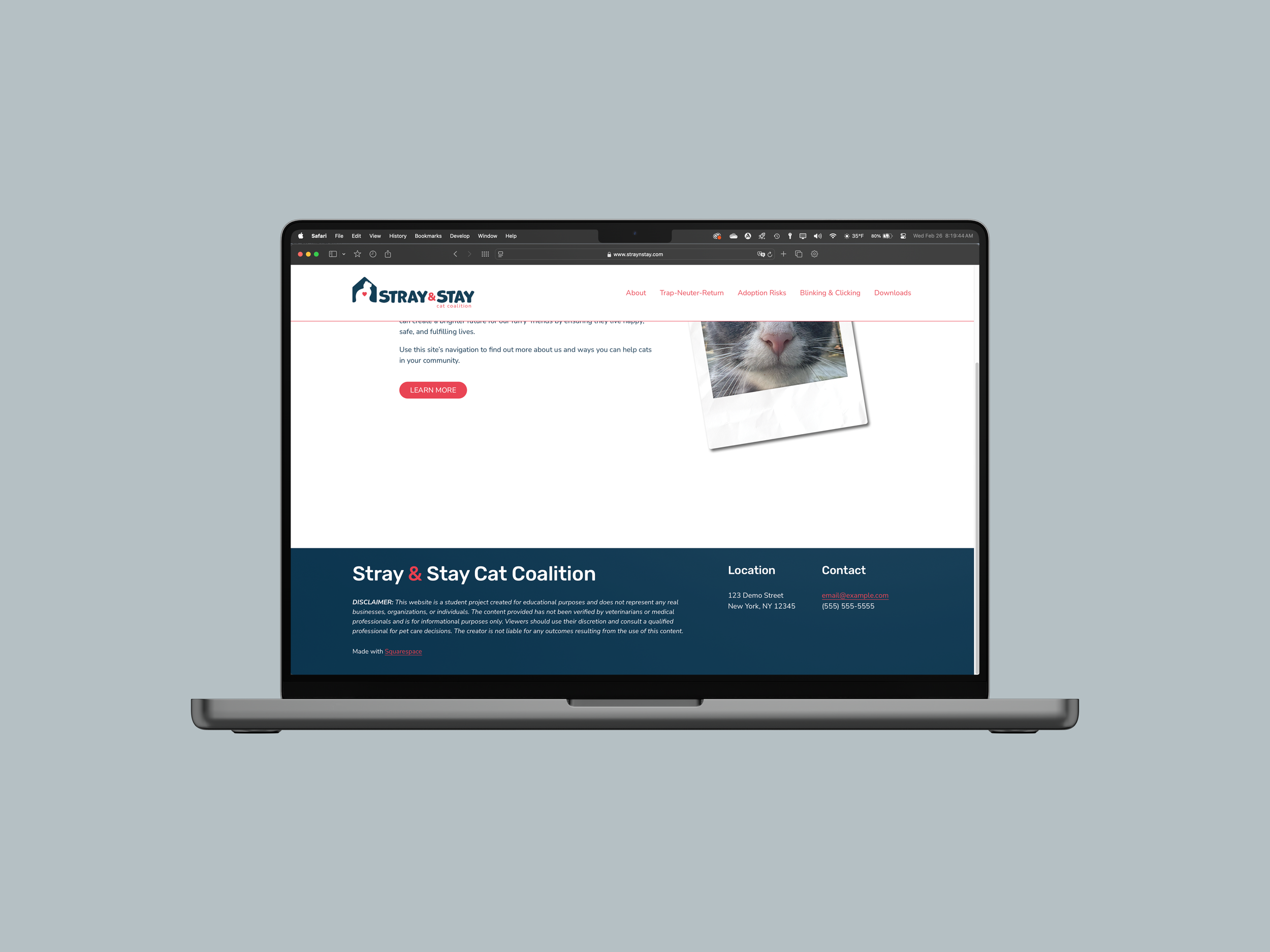
The final piece of the Tool Kit comes in the form of a resource website that has been alluded to throughout the entire project. This website serves as a hub for all the collected information contained within the Tool Kit to have a home in which users can visit at any time to find further information or resources. This website can be found at the following link: www.straynstay.com.
Based on my observation when performing the visual analyses, I found that iHeartCats, Alley Cat Allies, ASPCA, and all the other organizations encountered during the research process had some kind of online presence. In today’s digital society, it is essentially unheard of for a company or brand of any kind not to engage with a digital audience. To that end, I felt that having some kind of online presence would tie all the physical, print-based content together and could be easily accessed.
The design of the website needed to compliment the print-based content and at the same time be easy to read, navigate, and understand. For this to happen, keeping the website as minimal as possible was the best approach to keep visitor’s focus on the content rather than distracting them with visual extras. It was important, though, that it still maintained the same personal touch of the polaroids, and as such several of the polaroids found within the print-based materials also found their way into the website’s pages.
When landing on the main website, visitors are greeted with a close-up of a community cat polaroid photograph. The cat is looking directly at the viewer and makes for an excellent way to immediately engage with anyone arriving at the site. The tagline “Help Us Help Cats!” sets the stage and a welcome statement introduces visitors to the site. The site’s overall style makes use of the colors of the brand, white, black, rose red, and a type of navy blue. The backdrop to the entire site is a clean, white background with the polaroids sitting atop that background with drop shadows giving the illusion that they sit atop a solid surface, much like the physical deliverables give the illusion of polaroids sitting on a wooden table.
The header of the website, found on each page, also makes use of the white backdrop and includes the horizontal logotype that also acts as a button to return to the home page. Along the right side of the header are links to pages on the site where visitors can find more information of their choosing. These hyperlinks—as well as all other hyperlinks on the site—make use of the rose red color of the brand’s visual identity, while headers blend the navy blue and rose red. Finally, each page also includes a footer that contains a disclaimer given that this is a student project, and if the brand were a real organization, then its contact information and location would be found here as well. In contrast to the header, the footer uses the navy blue of the brand’s color palette as its background and white for most of the text, while rose red follows up with accents and hyperlinks or downloads.
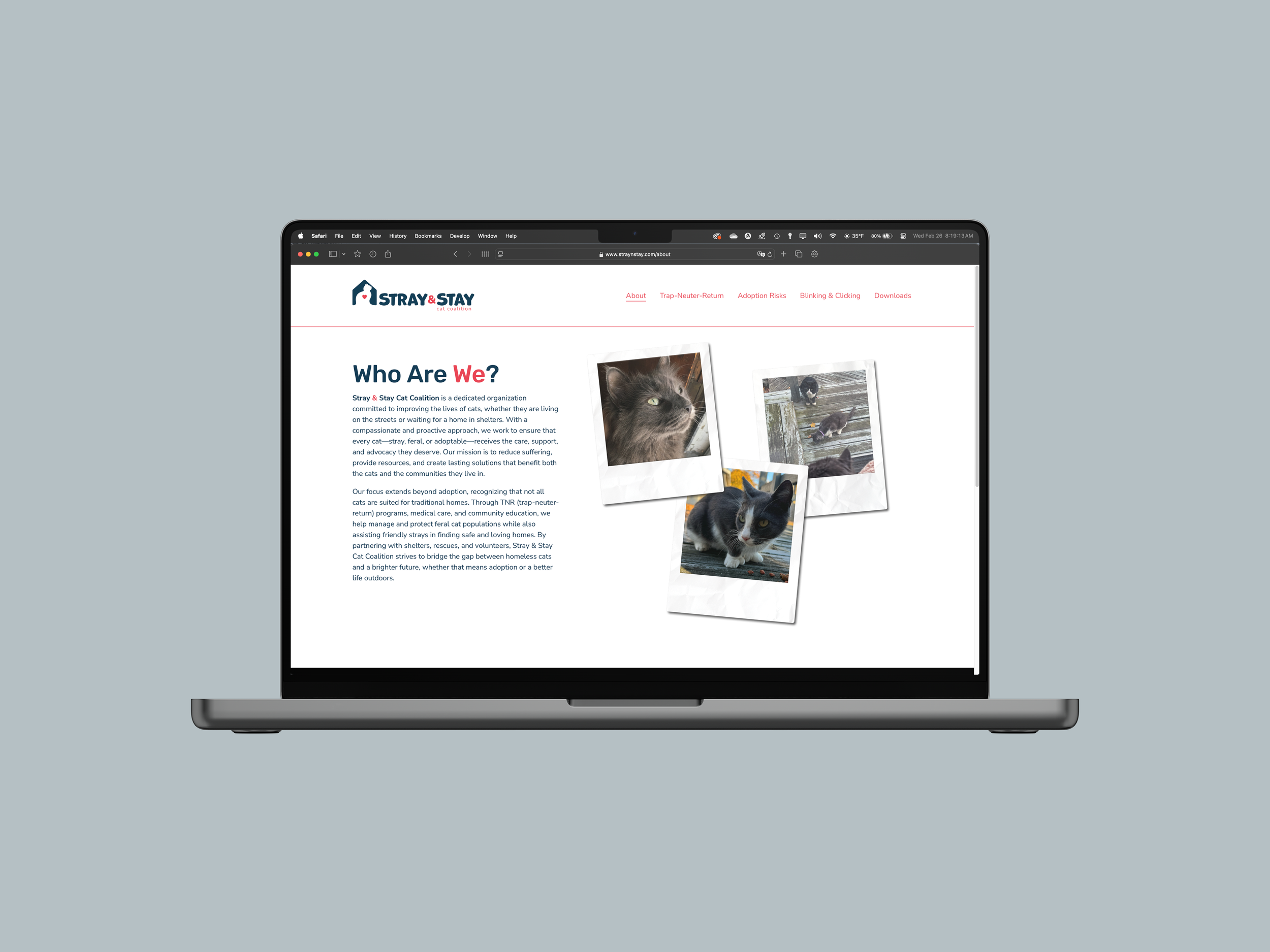
Each individual page within the website follows the same visual theme. The About page provides context regarding who Stray & Stay Cat Coalition is and what they do. As with most of the pages on this website, it includes a handful of cat polaroids on top of one another to continue the nostalgia theme. The Trap-Neuter-Return page is directly linked to the TNR Fact Book & Guide and TNR Doorhangers. In fact, both of those physical items include scannable QR codes that will take users directly to this page on the website where they can find more details than can be provided in the book and doorhanger. All the details regarding TNR and the steps involved can be found here in greater detail. The next page is the Adoption Risks page. Similar to the TNR page, this portion expands some of the information found in the brochure, concluding with a link to a downloadable PDF of the trifold. The Blinking & Clicking page provides additional context regarding the strategies found on the posters within the kit. Once again, the QR codes found on those posters will take users directly to this. Visitors can also download the posters as free PDF’s here as well. Finally, users will find the Downloads page that collects all the physical elements of the Shelter Cat Advocacy Tool Kit in one place ready for free download as printable PDF documents. The goal of Stray & Stay Cat Coalition is to help cats of all kinds, and to do that it is preferable that the information contained within the Tool Kit be made readily available for anyone who wants it or to share it. As such, it is important for the content be both free and easy to obtain.